
With today's redesign I wanted to incorporate the colors that remind me of winter, blue and gray. This is a very soothing color combination and can be warmed up with hints of natural materials. I've incorporated some dark wood tones and marble to bring this room together and livened it up with some geometric prints.
1. Keys Carpet from Kravet.
2. Kivik sofa from IKEA.
3. Button chair from Target.
4. Marble table lamp from Overstock.com.
5. Handcut wood end table from Etsy seller terrengomez.
6. Accent pillows from here and here.
7. Capiz shell wall decor from CSN.
Showing posts with label Space Redesigns. Show all posts
Showing posts with label Space Redesigns. Show all posts
Monday, December 13, 2010
Monday Redesign: Winter is Here

Monday, December 06, 2010
Monday Redesign: Danielle's Living Room
Happy Monday everyone! Danielle contacted us about her living room and needed help designing the space. I asked Danielle a few questions, and in her own words, this is what she had in mind for her new space:
"A modern, chic & calming space design. And the main things I want accomplished are to have a painted {or wallpapered} accent wall. I'd like to get rid of the chaise and love seat and replace them with 2 arm chairs - If there's space for another chair in the living room, I'd love to see a third chair for additional seating. So, a new seating arrangement will be necessary. We'll be installing hard wood flooring in the living room in the near future, so a color suggestion would be very helpful.The fireplace has this 70's rock material happening that I'd like to update in some way. If you have any ideas to share I would love to hear em'!"
So to work I went on a space design. Just so you have an idea, here are a few pictures of Danielle's space currently.
The first thing I worked on was the floorplan. Danielle wanted a more open layout with three chairs in addition to the sofa, if possible. Here are the changes I made with the new floorplan pictured below.
- Mount the television above the fireplace to give her more room to work with.
- Place a bookshelf on each side of the fireplace to balance out that wall.
- Place two chairs across from the sofa to make it more conversational as well as the best use of the space. This will give Danielle ample access to her sliding door, and great traffic flow through the room. And if she needs to turn those chairs around, say during movie night so everyone can see the tv, it should be easy enough to do.
- For additional seating, a bench would be great centered on the wall with the opening to the dining room.
- I kept Danielle's end tables and coffee table as requested.

After planning the layout, I did a little shopping for the space. Here is a mood board for a visual of the new space.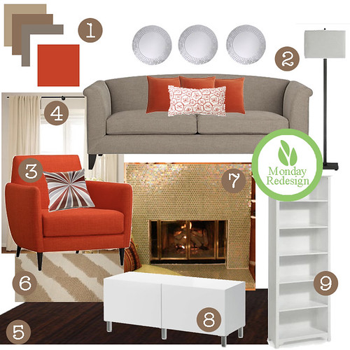
And now for a breakdown of the goodies:
- The color palette actually derived from the pillow sitting on the orange chair {#3}. It has a neutral base, but color pops using contrast throughout the room {with mainly the orange and whites}. The bottom color of this palette is Danielle's existing wall color and the color on top of that is the color suggested using for the accent wall. The color is Behr Pepper Spice.
- I love the modern and sleek look of this couch. It's the Silhouette Sofa from Crate & Barrel in Maya: Taupe. I would put three of these pillows and one of these on the sofa to bring in the orange color. I loved the idea of hanging the three mirrors Danielle already has on hand from Ikea above the sofa. It will make a great statement and mimic what I think she should do for the fireplace. I also think this Nash floor lamp is great to put either behind her end tables for additional lighting, or next to the bench. A pair of them in the room would be nice.
- I saw this orange chair, and immediately fell in love with it. It has such clean lines and fits Danielle's room so perfectly. It's the parlour tangerine chair from CB2. I would recommend a pair of these placed across the sofa each with a bull's eye silk pillow in berry from west elm.
- To dress up the sliding glass door, I would recommend putting up some drapes, and Pottery Barn has great drapes at an affordable price. I would get the Cameron Cotton Drape- two of them in the 50 x 96 length in white {hang the rod about a foot above the door frame, and let the drapes pool slightly on the floor}. This will make the window seem bigger and more expansive.
- I went with a darker wood floor to give a little contrast to the neutrals in the room. I found a great wood floor at Lowe's made by Natural Floors by US.
- I placed an 8x10 rug underneath the sofa and chairs to tie everything together, and so it didn't feel like the chairs were floating in the middle of nowhere. I love the flexibility of FLOR and recommend the Sophistikat in Barley. 30 tiles to make an 8x10 rug.
- Danielle has a couple options when it comes to the fireplace. She can either paint over the rocks {in this case, I'd paint it all white}, or remove the rock and start over. I went for removing the rock and starting over. I would recommend something like this fireplace {scroll to photo 4 of 10} as it puts a little more chic into this modern room. I found this tutorial online too that seems like a pretty good step by step.
- To provide additional seating in the room, I would get the Besta bench from Ikea. I would recommend placing it just about centered on that wall.
- To balance the room, I put two bookcases in the room, one on each side of the fireplace. I would recommend the six shelf in the 36" width in white. The bookshelves should be place nearly centered between the wall and the fireplace on each side.
So what do you think? Is there anything you would add?

If you need help redesigning your space, check out our services here.
Monday, November 15, 2010
After: Shelly Townsend Photography Studio
For the last few months I've been working on a photo studio! Last week it was completed and celebrated with an open house! I absolutely LOVE seeing finished designs! Shelly, on top of being a fabulous photographer and actor, is DIY to the core! Did I tell you that on our first meeting she confessed to me that she fixed her leaky dishwasher!?! I'm not sure that's something even I would attempt. So I knew that she could handle some DIY projects for her studio.
Her goals were to turn this room that's over their garage into a working photography studio for her growing business, Shelly Townsend Photography, as well as to leave space for watching movies as a family when not being used as a studio. One of the big changes was to put in a more durable floor as carpet doesn't hold up as well for lots of traffic. We needed to add window treatments too, ones that would allow Shelly to have complete control of the lighting in the space. Blackout lining was the key to that!
Her husband works in marketing so making sure that the space was consistent with her branding was key in the color selection. We wanted all the pieces to be able to be used as props as well. Sounds like a tall order, huh? But I love a challenge!
Here's what the space looked like before:

And here's the finished studio:


Guess which parts were DIY? Would you believe if I told you everything except the sofa and lamps? Yep, you heard me! Shelly sewed and made the cornice board, curtains (including blackout lining), circle pillows, and the rug, which might be my favorite thing in the whole space! We worked out all the details and she made it! (I'll try to do a tutorial to show you how to make your own circle rug! It's easier than you think and would be great at a smaller scale for a bathroom or kitchen.) The end tables were made by my fantastic wood worker, Russ. (If you are in the Dallas area and need some custom wood work done for a reasonable price please let me know because I have the perfect person for ya! I'll never use anyone else!) They actually have removable lids so that the insides can be used for prop storage! The flowers are vinyl decals that can be changed out if Shelly wants, or if she's doing a themed photo shoot. Pretty cool, huh?
Thanks so much Shelly for calling us up to help you with your space! I couldn't be more thrilled with the results!
Monday, October 18, 2010
Monday Redesign: Sneak Peek Photography Studio
I've wanted to show you this for a little while but I've been waiting because I'll be able to show you actual finished pictures soon! I've been working on a photography studio for a very talented woman: Shelly Townsend Photography. (Not only does she take great photos, but she does some amazing acting and styling too!) The open house will be soon where I'll be able to show you some real live before and after pictures. I thought I'd show you a few snippets of what we've been working on!
Can't wait to show you the before and after pictures! You won't believe it!
Monday, September 13, 2010
It's a Bird, No, it's a Plane!
Happy Monday, everyone!
I've told you how out of control I am lately, right? There is a sense of urgency lined in everything I do, it seems. This weekend we had arranged to meet with some friends for a bbq. I arrived at their door with a warm dish to share, and my lovely friend, Kristen greets me.
Kristen: "Hey Deb! You look great!"
Me: "Ah, thanks. I feel like I'm going to explode."
After chatting for a little bit, Kristen says, "So I think you're a week early."
{Imagine the embarrassment on my face-- my face turns bright red}
Me: "Really?! Could my prego brain get any worse?"
Seriously. I feel like the biggest ditz walking the planet right now. I can't remember a darn thing {obviously} and apparently my sense of urgency has taken over my social life too. After visiting a short time with my friend, I asked my husband why he wasn't giving me a hard time. Because we really, really like to make fun of each other. It's what we do. He said, "I'm going to give you a pass on this one." I think he could tell how embarrassed I was because my face didn't turn back to a normal shade for about two hours.
On a decorating note, I am so, so close to having my son & baby's room all decorated. Here's one of the fun things we've added to the room in the process, and let me just say that my son is ecstatic. He won't go to bed without saying goodnight to his plane about a million times.
If you're curious, we purchased the vinyl sticker here. They made it a custom size to fit the wall- 96" x 77"- we wanted the plane to appear like it was coming out from the bed.
I promise, more pictures will be coming soon.
And no, I couldn't love my cute, cute son & husband any freakin' more.
Monday, August 30, 2010
Monday Redesign: Janna's Family Room
A short time ago, I had the joy of working with Janna on her family room space. Her family room is a great open room with a lot of windows. She had a couple challenges, though. So we stepped in to help her out!
Here is a picture of the space and what we had to work with:

Janna's family room had a few challenges that made the layout tricky.
- A built-in bookshelf spanning the entire room
- Large, angled windows on one side
- A great, open floor plan, with little wall space
Below is the floorplan that suggested for Janna. To be quite honest, it's not all that different from what she originally had, I just tweaked a few things. I placed smaller chairs for the seating area by the window, and suggested that she move the couch and love seat over {towards the windows} to allow more room for traffic flow. I also added a floor rug for the main visiting area to help ground everything on the tile floor.

And here is the mood board for her new space:

A break down of the goodies:
1. I used the Tullsta chairs from IKEA covered in the Licorice Emilio fabric from JCaroline Home.
2. The Ottoman is a large 18″ square one from JCaroline Home covered in the solid Chocolate fabric.
3. Accent pillows from JCaroline Home covered in solid Chocolate and Marzipan Clarise.
4. I wanted to keep the window treatments simple in the space so I went with these white window panels from Pottery Barn.
5. Accent rug (8x10) from FLOR. This is the Feelin Groovy pattern in Russet.
This redesign was done in partnership with Glamour magazine, JCaroline Home and FLOR. If you’re interested in hiring us to help you redesign your space, check out our services here.
Monday, August 23, 2010
Living Room Redesign: After
Remember Celia's living room from Friday? Here is her new layout: 
I wanted her to have a distinct entry way, while still allowing space for the living room. She needed storage for shoes and outdoor items so the bench/storage option will give her some much needed storage. By placing it where I did, I've given her a distinct entry way. To the right of the entry way is a practice area for her piano students while the upright piano stays where it is so that another student can be practicing there as well. (The practice piano has headphones so two students can be practicing at the same time.) By pulling the Sofa and Chair 1/2 into a tighter arrangement we made room for the entry and practice area, while still making room for an actual living area, all within the same room! The best thing about this design is that most of the furniture in the room she already has. She'll be buying a small computer desk from IKEA for the computer station and will be making the storage bench herself. Her new color palette I gave her to work with looks something like this:
She already has the dark sage green and will be adding the blues as accent colors. The warm, neutral will be painted on all the walls to help bring the space together even more! Can't wait to see the finished product!
Friday, August 20, 2010
Living Room Redesign: Before
This living room was challenging and fun to work on. Celia teaches piano lessons out of her home and uses her living room as her studio. She's got a growing family and still needs her living room to be a living room, as well as accommodate her piano, practice piano, and a space for her students to work on theory games, etc. Was it doable? It sure was! Here are the before pictures:


You'll just have to wait until Monday to see her new room layout! Have a fantastic weekend everyone!
Monday, August 09, 2010
Monday Redesign-Entry Way
I love a warm, inviting space! The best thing you can do to make your home more inviting is making sure that the first space people see mirrors the rest of the house in it's style. Today I did a redesign of an entry way. I wanted this entry way to feel inviting, but modern.
1. Meredith Sideboard from Ballard Designs. I love the classic feel of the piece with the more modern shaped door fronts.
2. Custom Family Silhouette from ishootnouns on Etsy. (You can even get it customized in different colors!)
3. Selection of glass vases from Pier 1 Imports.
4. Hand-tufted rug from Overstock.com.
Monday, August 02, 2010
Monday Redesign: Susan's Living Room
Recently, I helped Susan makeover her space. In Susan's words she described how the space is used:
The family makes heavy use of the desks/computers. Incorporating at least one of them is important. This room is used for watching TV, some video gaming, computer usage. This is the room our family uses most frequently.
Here are a couple pictures of Susan's space before.


In designing the space, I kept with the neutral decor of Susan's home and added a little bit of color using apple green. I completely understand the need for computers in the home so I kept one of the desks in the room, but moved it to the wall where the television sits currently. This will make it more of a work area, when needed, and then the rest of the room for more of a lounge/television watching area. Where the two desks were currently placed, it took over the focus of the room. I placed the two chairs and ottoman from JCaroline Home against the windows so if extra light is needed for reading, it is available. I moved the television and stand against the wall across from the windows. Since Susan said that the curtains are normally drawn when watching television, I figured the glare wouldn't be much of an issue. I added an 8x10 FLOR rug that will cover a large portion of the room and will bring everything together. Behind the chairs, I changed the window treatments to white. This will provide a slight contrast in the room, but still keeping everything neutral.
Here is a the new floorplan proposed for Susan:


A breakdown of the goodies:
- I used the Tullsta chairs from IKEA covered in the Earth Beads fabric from JCaroline Home.
- The Ottoman is a large 18″ square one from JCaroline Home covered in the solid Apple Green fabric.
- Accent pillows from JCaroline Home covered in solid Apple Green and Earth Stacks.
- I wanted to keep the window treatments simple in the space so I went with these white window panels from Target.
- Accent rug from FLOR. This is the Pop Tartan pattern in brown.
- To tie the space together, I recommend getting this painting to place above the fireplace with some of these green footed hurricanes from West Elm.
- Lastly, I added some plants on both sides of the fireplace as I think a little natural greenery in a room can go a long way. These can be any plants that are 2'-3' tall.
This redesign was done in partnership with Glamour magazine, JCaroline Home and FLOR. If you're interested in hiring us to help you redesign your space, check out our services here.
Monday, July 19, 2010
Monday Redesign: Bedroom
Happy Monday everyone! Was your weekend as hot as mine?! I about melted away with the humidity. And keeping with the theme, I have a very personal and hot redesign today. As you know, I've been working on our master bedroom. Over the weekend I worked on some wall art.
And it was a big fail.
So now I'm back to square one.
When I feel like I'm at square one, I like to get ideas down on paper to see if I like where my vision is headed. {Because sometimes things look better in my head than they do on paper}. The paper never lies, I tell you.
In our master bedroom, I'd like to incorporate a little yellow. {Note: I haven't run this past the mister so we'll see how well this flies}.
Here's what I've envisioned for the room so far:
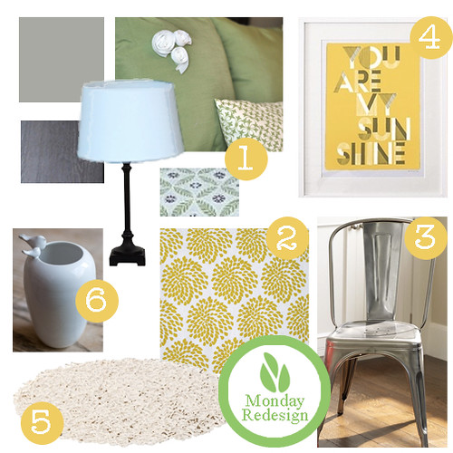
- This is what is currently in the room: {upper left corner clockwise} paint color, pillows, bedding, lamps, wood finishing on bedroom set.
- I'd like to cover the white lamps with a print like this one. I'm not sure if she sells it anymore as the color isn't available in her etsy shop.
- I have about a 2'x2' area between the wall and the dresser. I would like to add a sidechair with some wall art hanging over it.
- This wall art might just do the trick, and it makes me happy.
- Above the end tables, I would add some simple wall art. I would take these placemats and spray paint them white. I think with the lamp shade covers, it would be a nice simple touch that would feel balanced.
- I would like to accessorize the end tables too with lovely treasures like this birdie vase. So sweet and cute.
The one item that I keep going back and forth on is whether or not to paint the end tables white. They are more of a cherry finish. The mister says no --- mainly because I have an obsession with painting things white, and sometimes it backfires on me. I'm just sure it would make everything look a million times better. What do you think? Should I paint them white, leave them, or do something else?
Monday, July 12, 2010
Modern French Provencial Redesign
This design is based off of these fabulous plates that I found in Paris at La Chaise Longue.
I was so protective of them that I counted them as a carry-on for the plane and they didn't leave my sight until I unpacked them safely in my kitchen! I love the modern, colorful take on a very classic design!! This would probably be the kitchen I'd want to display them in:
1. Kitchen Island from Kitchen Island Co. What better way to let the colors take center stage than with a mainly neutral kitchen?
2. Green Brita Water Filter from Target. Love the new colors! Perfect to go, straight from the fridge!
3. Fiesta dinnerware in coordinating colors from JcPenney. Don't be afraid to mix and match the colors!
4. Measuring Spoons silhouette from OodlesofColor. Don't you just love it? The shop owner will also do custom colors of the print, so be sure to choose some colors that correspond with the plates too!
5. Custom chevron curtains from Nenavon.
6. White bar stools. A perfect place to sit and enjoy all the color! If you're really digging the color, try reupholstering the seats in some coordinating fabric!
Monday, June 28, 2010
Redesign Favorites
I was recently looking back at all of our Monday redesigns and thought I'd share a few of my favorites to date:

Colorful Patio Redesign. Just in time for summer!!

Citrus Dining Room Redesign. Still love this color combo!

Chic Office Redesign. You voted, we designed!
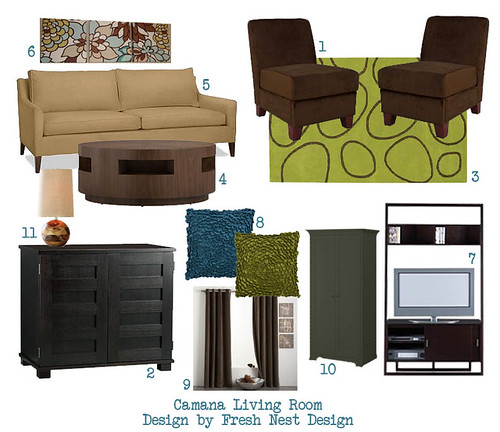
The Camana's Living Room.

Same room (almost) with different budgets!
Have a fantastic week everyone!
Monday Redesign: Master Bedroom
1. Angela Adams Freddy Chocolate Accent Rug.
2. Savannah Leather Bed frame from LA Furniture Store.
Monday, June 21, 2010
Monday Redesign: Living Room
Happy Monday everyone! I hope you had a great weekend. I spent the weekend getting ready for some upcoming travels and hanging out with the fathers in my life-- my husband and my dad. It was a great weekend and it's hard to believe Monday is already here.
I'm starting the week off here on Fresh Nest with a Living Room redesign. I was in the mood for some yellow and blues and this is what I came up with.

And now for a breakdown of the goodies:
- I like the look of this sofa. I love its simple and clean lines.
- I accented the sofa with pillows found here, here and here.
- This rug gives a great foundation to the room and incorporates some blues. I also love the pattern. Again, simple, but lovely.
- I decided to place only one end table in this room. I was afraid having two of these end tables in the room would be a little overpowering. This piece can also work as a smaller coffee table too.
- I wanted a mirrored-style lamp that played off the subtle geometric theme going on in the room.
- I love all the wall art options that inhabit offers. I thought this piece would be perfect above the sofa.
So what do you think? Do you like this new living room? Is there anything you would add or change?
Check out some of our other redesigns here and if you need a little help with your space, our services are listed here.
Monday, June 14, 2010
Monday Redesign: Sitting Room
Today I wanted a redesign based off the simple graphic lines of the accent pillow below. I wanted to keep things light since the walls will be saturated with a nice peacock blue!
1. Cream Oval Back Settee from Overstock.com. Clean and elegant. I love how it's a good size, but looks lightweight!
2. Pillow cover from KainKain. Love the graphic design of this pillow!
3. Peacock Print from Philly22. Love the large graphic. Print it large enough to look like a piece of custom wallpaper.
4. Modern Silk Stripe window panels from West Elm. These are a pretty basic design. You could probably make your own pretty easily.
5. Glass lamp from Lamps Plus. Keeping things light, I chose a transparent glass lamp.
6. Chambre end table from Macy's.
7. Wirebirds by MFAS. These would make great little conversation pieces for an accent table!
Tuesday, June 01, 2010
Stephanie's Living Room Progress
I love hearing about the progress of redesigns. It is so fun to see the design on paper come into action. Remember Stephanie's Living Room redesign?
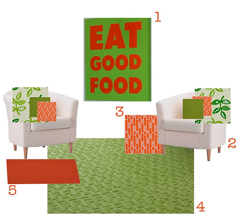
JCaroline has been busy finishing Stephanie's upholstery and posted a picture of the chair set with the ottoman and pillows.

And I fell in love. Don't you just love Jessica Jones fabric designs paired with JCaroline's mad upholstery skills? I think this color combination is so wonderful and I'm so glad Stephanie was brave and let me have my way with her transformation. I can't wait to see the pieces in her home.
JCaroline Homeis now offering many more solids in her fabric choices so go on over and check out her work. She makes ikea chairs fit you and your style.
Subscribe to:
Posts (Atom)




 Posts


