You know that I've been working on updating some of the elements in my Living Room. Next up on my list are new throw pillows for my sofa. I decided that I wanted each one to be different from all the rest. That way I'll have an eclectic, yet coordinated look. I've already got 4 designed and hopefully by Friday (sewing day) I'll have them all sorted out! Most of my fabrics are going to be from fabric designer Joel Dewberry's newest collection, Aviary. I'm using some from the Saffron color palette. The computer doesn't do it justice, I promise. The saffron color is very close to the poppy red I want to bring into my space.
Don't you just love the natural, organic feel to this collection? The first day it came into CityCraft (where I teach) I swooned and swooned over the patterns and color palettes! Can't wait to show you the finished pillows!![]()
Wednesday, March 30, 2011
New Pillows
Monday, March 21, 2011
Room Dividers
The open floor plans that many homes are built with now are great! I absolutely love open plans, however, sometimes you'd like a little bit of division between one room and another. Room dividers can help divide up the space and come in many different types. There are ones that are floor to ceiling and others that are only 3' tall. Others are completely translucent while others seem like a built-in wall. Here's a few different types that I love:
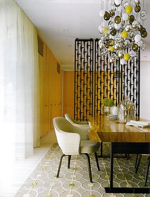

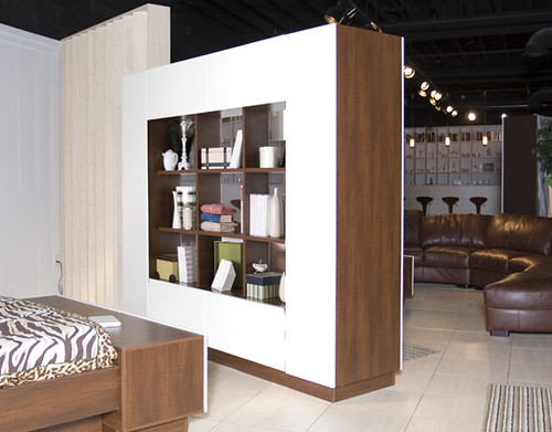
The best thing is that there's really no right or wrong way to choose a room divider. How much visual division you want between the spaces is completely up to you!
![]()
Monday, January 10, 2011
Painted Ceilings
I ran across this room and fell in love. The wonderful crisp white trim sets off the color of the ceiling wonderfully!
Photo from Ani-Bee.
What do you think? Would you paint your ceiling a fun color like this or would you stick with a neutral? I think I'd definitely be willing to try a color on that often neglected 5th wall after seeing this space!
Friday, January 07, 2011
Friday Florals
I love fresh greenery and florals in a space! I ran across these over at HGTV and thought I'd share a few. Aren't these spaces and arrangements gorgeous?

Have a fantastic weekend!
Tuesday, August 31, 2010
Back To School Design
Back to school means many different things to many different people! For those college students you know it's an exciting time! They get to live on their own, make their own choices, and design their own unique place! Here are some great little pieces to consider:
Writer's Block
Moustache Pencils
Fillsta Lamp from Ikea
Peacock Circles pillow from Pier 1
Speaking of layouts for small spaces, we now have a new option available to help with your home, apartment, or dorm room! This is perfect if you've already got the furniture but just don't know how to lay it out as efficiently as possible. This single room service is a one time fee of $75 and includes a new floor plan for your room. Visit the Hire Us page to learn more.
Tuesday, August 17, 2010
Drapes-To Line or Not to Line
I recently was talking with someone about their window treatments. (They are sewing some new ones themselves and wanted to know if they should pay the extra money and time to line them.) Most designers will tell you to line everything! I don't necessarily believe this, so here's what I look at when deciding whether or not to line.
Let's talk first about why you'd want to line them. There are multiple reasons to line those drapes:
-To give your drapes body so that they'll drape nicely instead of look limp
-To look consistent from the exterior of your home. Imagine standing outside the front of your house and seeing the back of all your different colored curtains...doesn't look very good, does it?
-To protect some fibers, such as silk and linen, from the sun. These materials can be broken down by constant sunlight.
 {Drapes from West Elm}
So how do you decide? Look at the material your using for your drapes. Is it thick? Is it thin? Is it neutral colored, or did you choose some bold colors or patterns?
For light to medium weight fabrics of a neutral color I'd opt to keep them unlined for a more airy feel. (Although lining them is just fine too.)
For light to medium weight fabrics with a bold color or pattern, I'd definitely line them. It helps to see the pattern better on the inside, and keep things nice looking from the outside as well.
For heavy material of any color I'd look at the back. Does the pattern show through on the back or not? If you don't like the look of the back of the material then I'd line them in a lightweight lining. Heavy materials usually have enough body on their own drape well.
A lot of it really has to do with the look you're going for!
Thursday, July 01, 2010
Architectural Renderings
In school I took a rendering class. I haven't done too much with them since school, but I recently took a Copic marker class to brush up on some of my techniques. Aren't the colors so pretty?
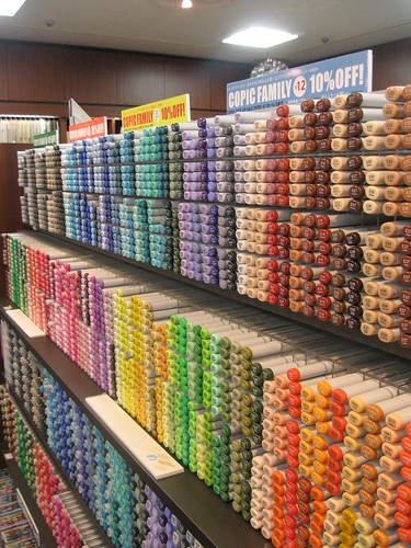
I'm so excited to do more renderings soon, but until then I found some gorgeous ones to inspire me! I'd love to make a mini-collage of these to put on my wall! Am I the only one that loves looking at floorplans, elevations, and other architectural drawings so much?
 {Drawing by Olechko}
 {Drawing from Betsill Workshop}
 {Interior Rendering from Ellen Nygaard}
Tuesday, April 13, 2010
Choosing a color Palette
There are many ways to choose a color palette for your room. Many people find it easiest so find one element such as an accent pillow, artwork, or rug to base your palette off of. This works really well if you can narrow down what type of color palette you like and then pull your main and accent colors from these items.
What if you're not really sure where to start? Try finding a picture of some inspiring images and pull a color palette from there. There's a color palette generator from Big Huge Labs that will help you too! Here are some pictures I found and the color palettes that were generated with these and some finished interior spaces where the palette was used. See how it all translates? {Photo from Bridgy2008}
 {Pendant from Lekker}
Friday, January 08, 2010
Tip #1: Displaying your collection
Most of us have collections, but are unsure how to display them! The best way to start is to give them all something consistent to start with. Like this layout of old rulers. But keeping the bottom horizontal line the same they've given some consistency to it and allow you to better see the individual rulers.
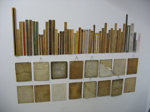 (Photo via Trip Press Print)
Wednesday, November 04, 2009
Benjamin Moore's Style 2010
Last night I had the opportunity to hear Mary Hoffman, a Color and Design Specialist for Benjamin Moore! I heard a little bit about Benjamin Moore and their process for choosing their color palettes for the year.

This is one of their color palettes for next year. I love the European feel to it! Very clean, chic, and contemporary!
I absolutely love color theory and anything having to do with color. I find it fascinating that they forecast the colors about 2-3 years out. So yep, back in 2007 they forecasted that purple would be big this year...and sure enough, we're seeing purple everywhere now!
To choose the color palettes they come up with a theme (or a few themes). The particular color palette above was based on Ingenuity. They saw that designers would be using color in unconventional palettes. Their other palettes were based off of New Luxury and Genesis. The New Luxury color palette featured rich purples, yellows, oranges, and darker bronze neutrals. Almost Eastern inspired. Their Genesis palette featured a much more monochromatic palette which focused on colors found in nature. Texture was a big factor in this particular color palette to provide some relief from the monochromatic colors.
She talked some about their paint (which I'll share later) but she hid paint chips throughout the store (Pottery Barn) and made it a game of finding them. She was showing some colors that coordinated, and some new color palettes we would start to see next year. Mary mentioned that along with more purple next year we'd start to see navy pop up again. (You heard it here first folks!) Here are some of the paint chips I found in the store:

We've seen a lot of yellow, grey, white color combinations, but pinks will be added to the palette next year too.

Love how this gorgeous green provides a soft feeling to all the dark wood tones.

Here's some more purple! Love it with the neutrals and metallics!
Be sure to check out their site! They've got lots of great resources and inspiration photos too!
Wednesday, September 09, 2009
Ask the Designer
We get lots of questions when we meet with clients! Many are specific to the project, but there are a few that we get asked quite often so we thought we'd share some of those questions and answers here:
Where am I supposed to hang these pictures?
Usually this refers to where to place them on the wall. The general rule of thumb is to hang them all at eye level, though I find that this is not really true. When we hang pictures, especially in front of a console, buffet, or sofa we're looking to complete the arrangement of art, accessories, and furnishings. If you have a low, modern sofa, hang your art piece no more than 12"-18" above the back of the sofa. If you place it at eye level in a situation like this, your picture may end up a few feet above the sofa and seem like it's floating and not a part of your arrangement.
How do I pick colors for this room?
This is a great question! Usually we'll start with one piece, maybe a piece of art, accent pillow, or rug, and base a color scheme around it. It's perfectly alright to just match paint colors from the inspiration piece for your room! Don't get hung up on which color will work, if you like the color, and it coordinates with your furnishings and accessories, go with it! Your home should be a reflection of YOU, not everyone else! If you just can't decide, or need someone to let you know that yes, it is alright to paint your walls grey and your ceiling black (hypothetically speaking, of course), be sure to sign-up for our phone consultations! We'll look at pictures of your space and guide you through the process!
How big of a rug do I need for my living room?
I usually go bigger, you want your rug to be larger than your sofa. A rug helps to pull your furniture arrangement together, and if it's smaller than your sofa, it's hard to feel cohesive. Can't find a large rug for your space? Consider putting 4 smaller ones together!
Thursday, July 02, 2009
Reading Fabric Labels-Part 2
So remember last week when we talked about what type of testing they do on fabrics to see how durable they will be? Today we'll talk about something else found on the fabric label: Cleaning codes.

Many times the furniture stores will tell you the wrong information on how to clean your upholstered pieces. Or try to sell you solvent cleaner, when your fabric can be cleaned with water as well. The best way to check is to ask them for the cleaning code. There are 4 different cleaning codes you'll see on your upholstery and window treatment fabrics. Here's a brief synopsis of them below:
W. ( water based cleaners) | S. (solvent or dry cleaning products) | W-S. (solvent and/or water based cleaners) | X. (vacuum or brush only) |
| To prevent overall soiling, frequent vacuuming or light brushing to remove dust and grime is recommended. Spot clean using the foam only from a water-based cleaning agent such as a mild detergent or non-solvent upholstery shampoo. Apply foam with a soft rag or brush in a circular motion. Vacuum when dry. Always pretest a small area before proceeding. | To prevent overall soiling, frequent vacuuming or light brushing to remove dust and grime is recommended. Spot clean using a mild water-free solvent or dry cleaning product. Clean only in a well ventilated room and avoid any product containing carbon tetrachloride which is highly toxic. Pretest small area before proceeding. | To prevent overall soiling, frequent vacuuming or light brushing to remove dust and grime is recommended. Spot clean with a mild solvent , an upholstery shampoo or the foam from a mild detergent. When using a solvent or dry cleaning product, follow instructions carefully and clean only in a well ventilated room. With either method, pretest a small area before proceeding. | Clean this fabric only by vacuuming or light brushing to prevent accumulation of dust and grime. Water based foam cleaners or solvent based cleaning agents of any kind may cause excessive shrinking, staining, or distortion of the surface pile and therefore should not be used. |
The biggest thing to remember is to always test it on a small, inconspicuous spot on your sofa. A favorite place of mine is on the fabric between the seat cushions. The fabric is never seen but provides a flat surface for testing. Always leave the test space fabric for a day or two. One time I performed a test, and it looked like it worked, then the next day there was a ring around both my test spot and where I cleaned in a very conspicuous place. Yikes! So, after you test, wait a day to make sure this doesn't happen to you!
Are you finding these helpful at all? Again, if there's any questions please leave them in the comments!
Wednesday, June 24, 2009
Reading Fabric Labels-The Beginning
Here on Fresh Nest Design we love giving you the tools to be your own designer because that's what we're all about! Part of that is making sure you know what goes into choosing durable fabrics so that you can make your own informed decisions! I won't talk much about choosing color schemes this time. (Probably in the near future though!) If you look at a fabric label you'll see much more information than just the name of the pattern and the color. But how do you decode everything else that's on there?

This label has lots of important information on there and we'll try to sort through it all in the next few weeks so you can ALL be experts! What do they mean when they reference double rubs? Well hopefully I can help a little! And if you have any questions please feel free to ask them in the comments and I'll answer then for you! If there's enough questions about different things I'll do a separate post.
The double rubs refer to a test where a special machine is utilized and a pad is rubbed back and forth over the surface of the fabric multiple times. This is done until a hole is worn through the fabric.
If it takes 25,000 rubs to make a hole than the fabric is labeled that it is durable to 25,000 double rubs. Some fabrics are rated for 100,000 to 200,000 double rubs! When compared to that amount, it seems like a 25,000 double rub fabric is not so durable, but in fact, 25,000 is perfectly fine for most residential applications.
Most of the ones rated higher than say, about 50,000, are for commercial use. When I design emergency rooms and I'm looking at the fabric labels to see what is safe to use on the chairs there, 50,000 is plenty for that application. (And emergency room fabrics get TONS of abuse and are used 24/7!)
If you're ordering a sofa and getting custom fabric from a furniture store this information might not be in plain sight. You may have to ask the sales associate to do a little more work and find out the information for you! But it will help that you can make a more informed decision about the fabric you're choosing! I hope this has been helpful and remember, if there's any questions be sure to ask them in the comments!
Friday, May 15, 2009
What about dark walls?
Do you ever wonder if people paint their walls in dark colors? I've seen some great rooms and some not so great rooms with dark paint. Below is a sneak peak of Enormous Champions dining room! I love the darker color on the wall! You'd think that it would overpower the space, but the room still feels so light and airy! The wood tones help to warm up the space as well!

It almost makes me want to try a darker color on my own walls! What about you? Would you try a darker color after seeing this picture?
![]()
Tuesday, April 14, 2009
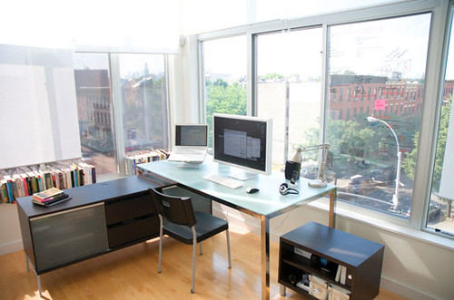
Make Your Home Office Work for You- by Guest Designer Kelli Ellis
We are so excited and pleased to announce our first Guest Designer here on Fresh Nest. Kelli Ellis is joining us this week with tips that you can't live without when it comes to interior decorating. How awesome is this, right?
 You know Kelli Ellis from HGTV's Takeover my Makeover, TLC’s Clean Sweep or Bravo’s Real Housewives of Orange County.that She has also contributed to magazines like Better Homes and Gardens and Redbook. Kelli is an Interior Design Expert and Design Psycologist, and is fun and witty to boot! Visit her site for more tips and tricks that she shares, along with her genius product, the Kelli Kit -used to help you layout your space before you get started. Welcome Kelli, we are so glad you're here!
 {image via flickr}
As a Design Psychologist, the ideal format for an office is the one in which manifests the most productivity! We all have different working "styles"; for example some of us like to "spread out" when we work. If you are a visual person you need to "see" all the working parts of a project in order to decipher it and complete it. For those of us that are focus challenged (easily distracted), we need to only have one task on our desk at a time or we'll complete nothing! Your working style must be determined in order to understand the space you require and the best way to tackle projects. Furniture placement is very important, as well. Again it is key to examine how you work and what tools are necessary to complete each task. For myself, I am visual and I need space to "see" my colors, fabrics, designs and ideas. I also need drawing space, computer space, printers and scanners nearby. If you have the room to spread out, it's best to keep like tools together. For example, my drawing table, art supplies and paper are all on one side of my office with display boards above them, likewise my desk holds my computer, scanner, printer and pull out writing shelf for more cerebral work. The key to my office layout is a rolling chair!
Hold out your hands in front of you - Your eyes and the ends of your fingers make your "working triangle"! Using Design Psychology, I have learned you need to see and be able to reach everything efficiently or you won't use them. If you can't access a tool, machine, or system, with little effort you won't do it! The piles on your desk will grow, along with your inefficiency. Make your office work for you so you can work less and relax more !