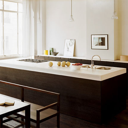
This kitchen is from the French version of Marie Claire. I get their magazine and LOVE it, even if it's all in French!

I love how this kitchen has no upper cabinets. They were able to make the surfaces long enough so all the storage is underneath the countertop. Not only does it look nice, but you can reach EVERYTHING that you have stored in the kitchen so it works better for those of us, like me, who can't really use the upper shelves without a stool! And it leaves room to hang artwork on your kitchen walls. Many times there's just not enough space to do that. I also like the thicker countertop and the contrast of dark wood and light surfaces! Beautiful!


1 comment:
yes, I agree! I love how this kitchen does not have upper cabinets; it allows the space to be more open, and brighter. I know we will start to see more of these in the future, its for ergonomic design.
Post a Comment