
We're doing something a little different today! We are BOTH doing the Monday redesign for Marie's Entry Room! Here are her before pictures. What's a little fun competition between friends?
Erin's Design-I tried to stick within Marie's budget and use what she already had as much as possible. It was pretty easy since she's got a great neutral sofa and loveseat already, and even the pillows can stay! Don't worry about the green carpet either, because the accessories in the space will help to tie in the carpet and make it look like you planned it there all along! She is great at projects so I've given her some ideas for inexpensive projects she can do herself to stay within the budget!
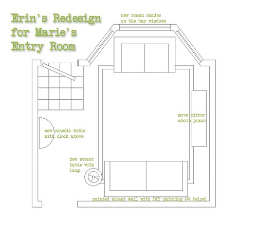
Moving things around just a little. I'd like to see the mirror moved above the piano and a large clock put above the console. Currently, the mirrors' scale is a little bit small for the wall, but by placing it about 12"-18" above the piano, it will help it to seem bigger because it is grouped in with the larger piano.
Erin's Concept Board:

1. This simple, elegant console table is actually from Amazon.com! And with a price tag of only $90 you can't beat it! The half moon is a great fit for the space on the wall between the entry door and the closet door. This is the main pathway through the space and a rounded table will seem to take up less space in addition to providing softer edges when walking by. We wouldn't want anyone running into sharp corners on the way out the door! (Mini design lesson: These half moon shaped tables can also be called demilune tables!)
2. Paint colors from Sherwin Williams will warm up the space while still keeping it neutral for the accents to shine through! The neutral colors I'd like to use are SW6121 Whole Wheat as the main color and the slightly darker accent color on the partial wall behind the sofa is SW6123 Baguette. Both of these are some of my favorites because their undertones have a warm inviting feel to them instead of a yellow, green, or pink undertone.
3. If you know how to use a sewing machine just a little, Roman Shades are some of the easiest window treatments to make, and they'd fit perfectly in Marie's Bay windows. All the fabric and hardware needed for this project can be bought for under $100! I'd make something similar to these from Pottery Barn. Use a light green fabric for the accent color instead to tie in the carpet color.
4. Round End Table from Target. This will fit perfectly by your sofa and provide space for a family picture or two and a accent lamp.
5. Jonsbo Orod Lamp from Ikea. Paint the inside of the glass an accent color of red or green to bring a little color to the area.
6.Homemade Clock for above the console table. I love this one but it's super easy to make yourself, and you can customize it with images of your family and colors that coordinate with your space.
7. Canvas art above the sofa. Use this art for a main focal point. You could buy a piece, but since the feel of your space is a little more modern, buy a blank large canvas and pencil a simple pattern onto it. Something with a bunch of horizontal lines in different widths. Then just paint them in different shades of red, green, and brown that compliment the space. Using horizontal lines will make the wall seem more spacious.
8. For accessorizing above the piano and the new console, find a mixture of light neutral colored vases and containers. Glass would also work. It will keep the design clean and let the artwork, pillows you've already got, and new clock shine through as your focal points.
Though it doesn't fit in the budget now, I'd recommend later on down the road getting a large rug for the living room. It will help to pull all the pieces together and not make it feel so much like everything is shoved against all the wall space. The ideal size would be a 8' x 10' rug. The rug will work now over the carpet and will also be a nice change when you put in your wood floors!
---------------------------------------------------------------------------------------------
Deb's Design-I know Marie was a little worried about her sage green carpet, and is possibly thinking about replacing it with wood floors someday. I tried to keep this in mind as I was planning the space so everything could stay around when the time comes to replace the floors. {Disclaimer: I did go over Marie's budget; however, I have some plans for Marie to use her money wisely.} I like to plan the space how it should be designed and I knew with Marie being crafty and resourceful, she could find similar items that I recommend.
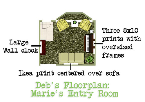
With the piano, a loveseat and a large sofa, there are too many focal points in the room. I had to elimate the loveseat to open things up a little bit. By having a loveseat under the bay window, it makes the room feel smaller so I'm sorry, but it needs to go! Sell it on craigslist and use the money towards your redesign. I suggest getting two chairs and an end table to nestled in the bay window. This still allows for plenty of seating (you can always use the piano bench too if more seating is needed) and it also opens up the room more. I also placed a console table in the entry way with a large clock centered above. I am suggesting that the existing mirror be put up on craigslist too. With the large wall space and vaulted ceilings, the mirror is too small for the space. Trust me on this one... just see where I go with it.
Deb's Concept Board:

1. The color palette I chose for this room has a warm feel to it. I thought it was important with the sage green carpet to accent it with some golden colors and white. The white will make it feel modern and clean. I suggest painting the walls in Sherwin Williams Green Earth SW7748. It is a grey green and will help incorporate the green of the carpet into the room, but lighten the room at the same time.
2. Marie also would like drapes on the windows. I think these drapes from Pottery Barn fit perfectly with our color palette. Marie is also crafty enough that she could find similar fabric and create similar drapes on her own.
3. I would place this lamp from CB2 in the corner, between the piano and the chair. I love its clean and modern look and it's a great deal too!
4. Target has some wonderful chairs for $299. A great selection too. A pair of these would be perfect in front of the bay window. They add just a little bit of color and fun to the room too.
5. I recommend placing a side table between the two chairs. You can't beat this side table in white from Ikea. A tall plant like this would be perfect on top of this table.
6. A large clock like this would be perfect centered above the console table. It adds some dimension and scales down the vaulted ceiling a little bit.
7. I love this console table fromPottery Barn {and it's on special too!}. I love the simplicity of it and its shelves. If you are wanting something a little less expensive, here is a great alternative from Target.
8. Above the piano, I would place family pictures in these matted frames from Target. I would space them about 6-8" apart, side by side.
9. Ikea is great when you are looking for inexpensive art. Here is a great large print that can be framed and centered over the sofa.
I would also add a plant in the corner between the piano and the sofa. Having greenery is one of the easiest ways to freshen a room and give it a different element (height & texture). A rug and some accent pillows should also be added down the road, but I knew I was pressing my luck with the budget already. I had fun doing your redesign, Marie and I hope you enjoy it.
Marie also wanted a deadline to finish her redesign of the space. So Marie, send us pictures by July 1st. We can't wait to see what you've done!
Here's the fun part! You get to vote on your favorite. If you like Erin's, put Erin in the comments. If you like Deb's put Deb in the comments. At the end of the week we'll pick a lucky reader from those who voted. The winner will be one of our next redesign participants! Our slots are filling up fast so this is a great opportunity to make sure that you get a chance for us to redesign YOUR space at no cost!
 and
and 
P.S. Just a couple reminders...
Want a chance to win a toddler bed? Enter our design challenge here.
Does your deck need a little TLC? Enter our giveaway here.
Comments and voting are now closed. Thanks for your votes!


190 comments:
Wow! Hard decision. You both did an awesome job, but my vote has to go to Erin.
Erin gets my vote. But I love the two chairs instead of the loveseat.
Got to go with Deb. Love the chairs and full rug rather than sofa and area rug.
I think they are both beautiful but I vote for Erin's design - I love the choice of bright colors and the wall clock idea is SO neat!
Lovin' Erin's design.
I agree, it's a hard decision. I love the clock from Erin but I think I'll have to go with Deb's as my chocie. Good luck!
Both designers really nailed it, but I choose Deb. I don't know the Make and Takes author, but I faithfully follow her blog. Deb's design seems to fit her fun, fresh, no nonsense personality from her blog.
While I like them both, I'm going to have to vote for Deb!
While I like them both, my vote goes to Erin.
I can't believe Marie is letting US decide!!
I've been going back and forth between the pictures and finally decided on Deb's design. Both are great!
My vote is for Deb--I agree with the two chairs instead of sofa, though I love the demuline table in Erin's design.
Wow, I had to keep looking back to try and make a decision...so hard. I choose Erin's design.
I vote for Deb's design. It looks like it would be more "homey" without being too mainstream. I also love those colors!
I love them both but am choosing Erin's as my favorite!
Wow, both designs are great. I loved elements from each, but I think I have to choose Erin's design. I just loved the bright pop of color her room offered.
Erin's clock idea is amazing and I'm pretty sure I'll have to steal that idea. But, overall I like the concept of Deb's room with the chairs.
They are both so great, though!
Hard decision! But I'm leaning towards Deb's design.
Both designs have great ideas! But I am voting for Erins design!
I love the clock and shades and self-painted canvas above the sofa in Erin's, and if you have the money, definitely agree on the two chairs instead of loveseat in Deb's.
Can't you take the best elements from both designs?
I would go with Erin's plan, but put in two chairs instead of the loveseat. It is so nice to see both options laid out like this.
These are both INCREDIBLE designs...such a hard choice. But I'm going with Erin. Can't wait to see the finished room!
i love des's, especially because of the size of the artwork & the 2 comfy chairs.
I do like them both, tough decision - but I will go with Erin's design. I like the more modern feel.
i vote erin. love the clock idea!
Erin! I love the bright colors! And my family loves couches...the chairs barely get used. So Erin it is!
go with deb!
I would have to go with Deb's design!
DEB!
Both are great. I going to go with Deb's design.
I love them both, but I'll have to go with Erin.
I love the clock design on Erin's, but I'm going to have to vote for Deb's overall design. The two chairs replacing the love seat makes it seem more inviting.
Wow, both very cool, but I like Erin's more colorful and playful style, especially for Marie...Oh I hope I win! I would just die for a makeover for our front room, or bedroom!!
I have to vote for Deb's. I love Erin's design but I think Debs will hold it's own for many years and not feel outdated ever!
Deb's
I like ERIN's probably because of the colors...how fun!
These are great rooms! I like both, but I would pick Deb's room for the entry room!
I pick Deb's. I love the chair!
Hands down - Deb. I think 2 chairs changes the space immensely. The colors are nice too.
Erin!
I like them both; I'll vote for Erin's.
Tough decision. I think I lean towards Deb's design, but I love Erin's clock idea!
Deb!
Deb! I love the chairs, the clock, the art...everything!
erin. love the bright accents.
I love the clock idea of Erin's. The bright colors of the canvas have some pop. I say Erin wins it for me.
Both are great...I pick Erin because of the clock and striped canvas art work.
I would go with Deb. It's very classic.
i love them both....but Erin gets my vote!
Deb. Love the fresh white and tans. And selling the old and getting the new chairs...brilliant!
Hmmm... very difficult to choose! I think I'd go with... Deb's design.
I love both of them, but I think my vote goes to Deb. The only thing I would do differently is to swap Deb's clock with Erin's.
Both are great, but I vote for Erin's design.
I love Erin's design and color palate so I vote for her. But, if it was me, I would incorporate the 2 chairs under the bay window from Deb's design.
I vote for Deb's design, although both are great. I am in desperate need of design help for my room!
I love Deb's design. I agree that the loveseat HAS to go! Both designs are marvelous though!!!
Either would be great, but since I have to choose, I'm going with Deb's design.
Erin FTW!
I Love them both, fun and classic... I'd have to go with the fun design by Erin!
I really liked both suggestions and because I am also getting ready to redo my living room AND I have sage green carpet I found the ideas helpful. While I love the colors Erin choose and am a little hesitant about painting a room green that already has green carpet I liked the overall design of Deb's better. Love the chairs in the bay window and the artwork suggestions - although I think Marie would have a blast with Erin's clock. It was close but I think Deb's design will make more of an impact.
I like them both, but I prefer Deb's with the 3 prints over the piano.
I vote for Deb's design! I'm excited to see how it turns out! :)
Although I like Deb's floor plan better with the two arm chairs, my vote is for Erin's room. I love the colors and the clock is so fabulous!
It's hard to choose, but I think I like Erin's the best!
I prefer Deb's but would really rather have a rounded table.
Deb!
I vote for Erin!
I love both design plans, but will go with Erin's since my name is Erin too!
Both are very nice designs. I would go with Erin's design though. Love the items picked out too!!
Erin's because it reminds me a lot of my own entry room. Both are fabulous!
They both look great,but I think I'll go with Deb's.
I like the natural feel of Deb's room.
Erin's design, but Deb's clock.
I vote for Erin's room with chairs instead of a loveseat and photos instead of a large clock. Good luck. Very fun.
I like Erin's overall design best. But if it were my room, I'd probably end up incorporating ideas from both their plans.
Tough choice- they're both great! think I'd go with Erin's design although I love the chairs that Deb picked!
I vote for Erin...I like the lighter colors best!
Both are great...I'd go with Deb's design though.
I like Erin's design best, though Deb's is pretty great too. I really like all the colors that Erin used.
I like both, but I've gotta go with Deb!
My vote is for Erin! I love the style, and I made that clock for my entryway too!
I love both of them, actually. However, the picture clock idea itself sold me on Erin's. Such talented ladies!
Erin's! love that clock idea!
I chose Erin's.
Deb
Erin!
I vote for Deb!
Definitely going to go with Deb on this one. I think her room looks more put together and honestly I think Erin's clock would be fun for a little while, but it's just not a classic piece.
Both are great, but I think Deb's wins overall. I love the console table!
I really liked Debs plan best. Erin's plan was also very nice - just not my style.
Deb!
Wow!!! What a difficult choice!! You ladies are amazing!! And personally, I liked BOTH designs A LOT!!! But, I think I should vote for Erin's--mainly for money reasons (can you tell I'm really frugal?).
I have the UGLIEST living room on the planet. No design whatsoever, just hand-me-downs and cheap-o furniture. I could really use a room makeover!
*And I REALLY like Erin's clock! :)
Tough choice! I can see why the votes are split so evenly. But I think my vote goes to Deb. I really like what she did with Marie's color palette and I absolutely love the chairs and side table combo.
This was a tough decision!!!!! I think I will go with Deb, though.
Thanks!
I love them both but I think I like the colors in Erin's the best. Beautiful choices on both, though!
I pick Erin's. I think she captured best what was asked by the homeowner.
Erin's design is my favorite, although Deb's is a close second. Great designs ladies!
i have to go with erin's... that accent wall and that clock go so well together!
I love both! Maybe the clock and canvas from Erin's, and the set of chairs from Deb's.
Deb's!
Good job! What great talents you both have!! I like Deb's design.
I'm going for Erin.
Erin. LOVE the clock and splash 'o' color!
I really like Deb's, the colors are great! Although I LOVE the clock from Erin's and would use that instead!
I like Deb's. The room design is great. I do like that clock from Erin's room too though.
Both have great ideas...I'm going with Erin's. I love the colors and the clock idea.
I am going to have to go with Erin's. Love the clock!
Deb's!!!!!
Erins
I vote for Erin's...and not just 'cuz we share a name!
I like Deb's. The chairs add to the room.
I'm going with Erin's for color sake. But, I do like the chairs in Deb's.
Deb's, I like the chairs and wall color better.
I love them both, but I would choose Erin's design.
HANDS DOWN, ERIN's!
why? because Marie is so family oriented and Erin's seems more family oriented, fun colors, etc.
I love Deb's design, very warm and inviting, the color palette is great.
I like most of Deb's stuff better
Deb - but I agree that the clock from Erin's is too cool!
Deb it's very warm, natural, and inviting. Erin's feels a bit stark.
Erin's design
ERIN!
Debs.
I love Deb's design. It is so classic looking. It was a tough choice.
My vote goes to Deb
I like Deb's :)
I like Deb's design. The natural colors and the art are great and I love the big old clock!
I am going with Erin. Simple, but a splash of color and the clock design is just cool!
i have to go with erin's concept. i have looked at making that clock for myself :-)
I think Erin's design compliments Marie's creative side. Personally, I love the clock! There's enough color and unique pieces to blend well and not be overpowering!
Erin's all the way! Love the colors!
Erin!
Erin's is perfect.
I like Erins...it is more fun and playful. We are remodeling our home now. We have run out of money to design and decorate the rooms, so I am drooling over these choices!
deb it is- love the clock and console and general feel of the room
Erin's--I like the color scheme for Marie's family best. And I love the roman shades and the clock!
I honestly kept waffling, but I think in the end, I would go with Deb's design. But I prefer the half-moon table and the area rug. How indecisive of me -- but the great thing is, Marie can choose the elements she likes best because these are both awesome.
It's so hard to choose! I think I like Erin's slightly better (they are both great though!).
I like both, but am partial to barrel type chairs so I pick Debs Design. I do really like the curved table in Erins, though.
I'm voting for Erin's design, because she's going with the wall clock and mirror, which are two things that I suggested also. Way to go Erin! (But I like Deb's design, too)
Ok, gonna have to say Erin's as an Erin myself. ;) I like the clean simplicity of her design. I do appreciate the chairs that Deb chose though, as well as the use of plants. :)
I would choose Erin's. I love the striped canvas idea and especially the color splash it would add. I love all the colors. I do agree with Deb that the mirror is too small. But I say - see if you could find a bigger one at a thrift store or yard sale - they can really add a more spacious feel to a room!
A tough one but Deb's
Deb :)
ERIN.
Deb's design wins for me!
I think I liked Erin's better because I'm a super bargain shopper and it seemed to stick to a tighter budget. I liked the idea of copying some of the items and making them yourself. Can't wait to see the after pictures of the room!
Both rooms are great for different reasons. I think I'd go with Erin's though except I would want the console table from Deb's. Looking forward to the after pictures too.
I vote for Deb's
When push comes to shove I like Erin's better. I can't really put a finger on why, it just seems to go better with the home and feel of it all. Good work on both designs!
I'm voting for Deb's design...classic chic, clean lines, natural colors. Love it!
They are both great, but I really like Erin's design....especially the clock! I want one!!!
Both designs are great but I am going to go with Deb's design.
I like both, too, especially Erin's clock idea. I'm going with Deb's room for the overall design.
I think I vote Erin!
Tough-I like elements of both-but the framed photos and side table in Deb's design sold me.
I vote for Deb's - the design is a little more modern and feels more soothing to me!
I vote for Erin's Design.
I like Erin's design the best!! Love the clock idea!
Deb's!!! I love the design!!
I like both, but I probably like Deb's best.
I like Deb's - it's my taste anyway. Altho Erin's rocks the whole mid-century thing, so if Marie was looking for more modern, that'd be the one to choose.
I'm going to have to go with Deb's.
I vote for Erin's Design :) I love the clock art!
I like Deb's the best. But I like Erin's clock better! This is such a fun thing for Marie! yea!
I like them both. TOugh call, guess I will pick Erin's. Good work, my room next, please!
Deb's - hand's down.
I pick Erin's design.
Tough decision, Marie!! Erin's design is DIY friendly and fresh, but Deb's design is timeless...go with timeless plus your own spunky touches, Marie! Kudos on both designs!
WOW! What great comments! I too have really liked them both. If it's a tie, maybe I'll have to pick something from both of you!!
Thanks for doing this, I'm excited to put some life into my living room!
So hard to choose! If I must, I'd say Erin's room is the one.
I like Deb's design, but I appreciate the frugality of Erin's design. Deb's my pick!
I vote DEB
I vote for Erin's design. She has some really great, bright colors that will liven up that space and fit in with Marie's family.
Jessica
www.MomShots.com
Deb's design is my choice.
Erin's plan adds the color and zest that the room needs.
I like the color scheme Deb chose. It's calming and elegant at the same time.
I liked Debs design better; it is both contemporary and conservative. It goes with my taste.
Angela
Deb's--the colors won me over
Love them both, tough choice... I'd go with Deb's though, since she used a few items I've had my eye on for my own sorry living room!
I think the chair idea is good, but not the ones picked and I'm not fond of the clock Erin chose but I do love all the table ideas. I'd have to say I vote for Erin. The idea seems cleaner, less cluttered and a way better budget choice without having to try and sell items. If they don't sell you have to store them and end up with more clutter. Work with what you have and spend the extra on a get toghter to show off the new design! :)
Both designs are great...but I have to go with Deb!
Go with Deb.I know this room well,Marie, and the love seat changed for two chairs will make a huge difference. The pictures of family above piano just makes sense. This has nothing to do with seeing more of my grandkids :). This just seems more like you. I do love erin's clock. Ultimately does Marie decide? This is very exciting!
love them both! I vote for Erin's for Marie's room.
Erin
Overall: Erin.
However, I like the two chair idea better than the love seat.
Deb
I have to vote for Deb, while both the designs were very lovely.
I think that Deb's design allows for more open space and has a color combination that is welcoming and inviting.
I vote for Erin!
I vote for Erin's design, although they were both really nice.
Both are beautiful, but I like Erin's best!
Erin's design is the best :))
Post a Comment