We had some great submissions for our first design challenge! Who will win the Kelli Kit? It's your turn to decide!

Here are our entrants below:
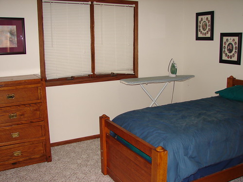
#1 Karen's Bedroom-Lincoln, NE
What Karen has to say about her entry: "Recently our youngest daughter moved out. The before picture illustrates what remained of her bedroom. We used a chest of drawers that we were storing in the basement along with some artwork that was not being used. We also used a flat twin sheet as a mock bedskirt. We had fun using what we had and are enjoying the outcome."
Karen Before
Karen After
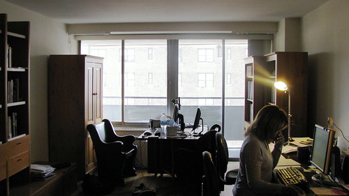
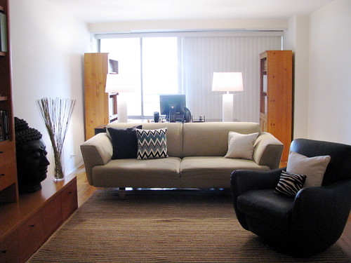
#2 Frances's Living Room-Forest Hills, NY
What Frances has to say about her entry: "I just completed this one day makeover for a client. We move the sofa that was in a bedroom to the living room, accessorized the existing book cases and moved the desk behind the sofa. We added a pair of lamps on the desk to create balance in the room and make the space feel harmonious. The leather chair was in another part of the apartment that works great in the living room giving it a casual but modern feel. The buddha head was also in another room, we used it here to add visual interest and also create a sense of serenity. Total makeover was completed in 6 hours."
Frances Before
Frances After
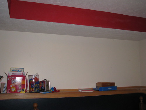
#3 Christy's Room-Lincoln, NE
What Christy has to say about her entry: "I did a little rearrange of my son's room. I had this amazing US map made of plywood and carpet samples. We finally got that hung up. I also moved the bed over to make a little reading nook in the corner. We placed a bean bag there so he can go and hang out if he needs some alone time."
Christy Before
Christy After
To vote: leave a comment on this post only and let us know who you'd like to vote for!
#1 Karen's Bedroom
#2 Frances' Living Room
#3 Christy's Room
Voting ends Thursday May 7th at Midnight! One vote per person allowed, all others will be ignored. Anonymous votes will also be ignored.
Entrants: Be sure to forward the link so everyone can vote for you!
Good luck!
 and
and ![]()


32 comments:
#2!
I vote for myself! #3.
I didn't know I was going to be competing against a professional! I thought we were supposed to redesign something in our own house. Makes mine look a little 3rd grade. Good thing the room is for a kindergartner!
I would like to vote for #3 Christy. LOVE THE MAP!!!
#2 Frances’s Living Room-Forest Hills, NY
The leather chair was in another part of the apartment that works great in the living room giving it a casual but modern feel.
#3 Christy
#1 Karen
#3 Christy
Christy #3
#2 Takes the cake Fo sho!
#2 all the way!!
I like number 3. Great idea for a childs room.
#2 Frances' Living Room - Forest Hills....Beautiful!
I vote for #3.
Christy told me to vote for her. #3. I do everything she says because I love her.
# 3
#2 definitely!!
I vote for #3 as well!
#2 By Far. I liked the change in arrangement quite well and within budget. The bedspread could use some updating would be my only qualm. Overall, I think this one certainly looked the best.
#3 Christy gets my vote!
#2!!! Love it! (Hey, I used to live right near you in Forest Hills!!! Best of luck! (Funny, I just announced a contest on my blog... anyone interested?)
www.myislandwedding.com
I vote #2 - Way to go Frances, it looks great!
This is hard because #2 looks straight out of a magazine. And since they're professional, that seems a bit unfair. So on behalf of all crafters everywhere, I vote for #3.
Wow.....#2 is amazing! We are impressed {although we do think that map should recieve a gold star for creative fun in recycling carpet squares!}
Thanks for following us on twitter - it is so fun meeting new people and seeing wonderful ideas like you guys have....love your site!
Karla & Karrie
#2 is really impressive! Playing "musical furniture" makes a difference. I don't think it requires a professional to do that! In fact... it has inspired me to switch a few things around in my own place...
#1!!!
I meant #1 and not #2. Sorry!
I vote for #3. Go Christy!
#3
#3 christy's
Gotta go with my girl, Christy! #3
Christy #3
I love Caleb's new room.
Post a Comment