Remember Addiana's Kitchen? Addiana came to us for help on how to layout her kitchen as the angled wall makes it a little harder to work with. First, let me share with you how I would layout the space.
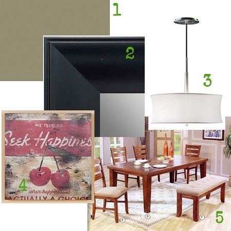
This is a birdeye view of how I would design the space. I focused mainly on the dining area in this picture for layout purposes. Since the overall dimensions of the space is 9' x 11.5' it makes it even harder to work. I would suggest getting a dining table with a bench so you are able to snug it up to the wall as much as possible. I would also make it darker than the kitchen cabinets to make it a foundational part of the room. Here are the elements & pieces I would recommend for the space:
- I would suggest painting the kitchen a different color. The ceramic tile floor and counter tops are a light color and there needs to be a visual contrast in the room. The paint color will help provide this and I would suggest a sage green like Benjamin Moore HC-125 Cushing Green.
- I would place a mirror on the wall behind the dining room table to make the space feel larger. I chose a black framed mirror to also provide more contrast in the room and give another foundational piece near the table.
- In my opinion, paint and light fixtures are the easiest and quickest ways to change the feel of a room. I would change this to be a more hip light fixture to give the room a fresh and clean feel. I chose a fixture from Lamps Plus.
- Of course, the Happiness print by Rodney White is incorporated. I would hang this on the wall next to the cabinets. Hang it at about 6' off the ground (the top of the picture hitting 6 feet).
- The foundational piece of the room- the table. As I stated earlier, I would find a table that allows for a bench. This table is also the perfect dimension for your kitchen- 5.5'x3.5'. Any larger and it wouldn't work. You can put it as close to the wall as possible and it will still look fine. Then when family and friends come to visit, pull it out so people can access the other side and use the leaf to make it extra long.
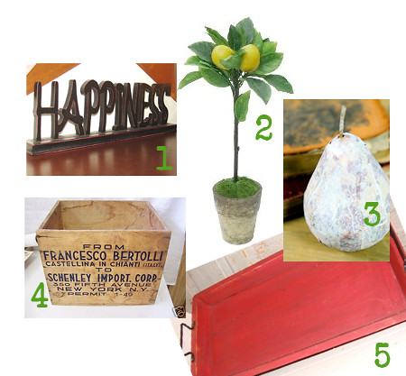
Another suggestion I have is to give your decoration some depth on the top of your cabinets. Choose items of varying height and width to give an eye appealing presentation. Here are a couple recommendations that I have:
- Happiness sign
- Tall Lemon Tree at Target
- Decorative pears- these can be painted white
- Wooden crate box
- Red tray- set this at an angle or on its side
I had so much fun redesigning Addiana's Kitchen and I hope this helps. If you have any feedback or items to share yourself, feel free to contribute in the comments below. Addiana, I wish you many happy and fun memories with your new design!!
Have a space that needs a Fresh Nest Redesign? Click here to submit your space.


7 comments:
LOVE it! I was convinced I needed a round table and still wasn't sure how that would work. Love the bench idea. I completely got sidetracked this morning with the LONG birth (48 hrs) of my nephew and just remembered I was being feature. Thanks sooo much, you did an awesome job. I'll have to send you pictures after the redo. :)
Great job, Deb. These are some great suggestions!
Great redesign Deb. I have plenty of spaces in my house that need to be redesigned. How do I submit?!
Addie- so glad you like it! Give you sister a pat on the back... that's a very LONG birth. Congrats auntie!
Robyn- You can submit your room for a redesign here.
Deb, my husband is doing the whole- I told you so bit about a table with a bench. Maybe I need to listen to him more!!!
Great ideas Deb! It's fun to see you help redesign a space!!
I really like the table with the bench idea-functional yet classy; very nicely done, Deb! I can't wait to see the finished photo!
Post a Comment