
Balance is VERY important in a great room design! It gives the person in the space a sense of calm and peace. There are two different types of balance:
Asymmetrical Balance and Symmetrical Balance.
Symmetrical Balance is very balanced and even in nature. It has a sense of symmetry and many times is much like a mirror image. If you take half the room and mirror it, it will look the exact same! Symmetrical balance is very easy to design and is great for a beginner!
Asymmetrical Balance is just that, asymmetrical. It uses different elements of design like color, texture, and size variations to appear balanced, even though it's not a symmetrical mirror image. Asymmetrical balance is a little more difficult to balance out but can be done with a little practice.
Here are some examples and my explanations of how they are balanced:
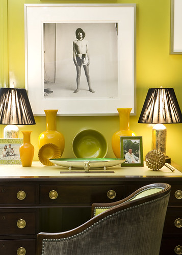
This one is almost symmetrical, but not quite, therefore I'm labeling it Asymmetrical. The left side has three different similar colored objects (picture frame, small yellow vase, small yellow bowl) that balance out the two darker objects (green frame, pine cone) of the right side.
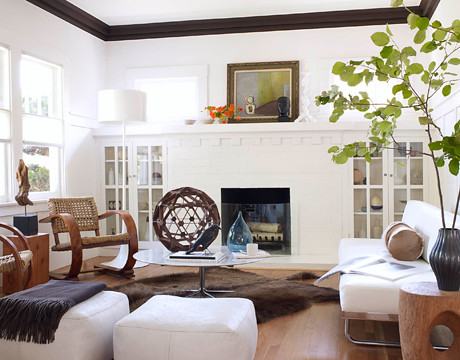
This is a great example of asymmetrical balance. In this photo the artwork on the mantle is not symmetrical. The white and black accessories, though they take up much more space than the orange arrangement, are balanced well. By choosing the white candlestick, it blends into the wall and feels less visually heavy than it really is. Even the furniture is asymmetrically balanced. The large white sofa balances well with the smaller, darker wood chairs and end table.
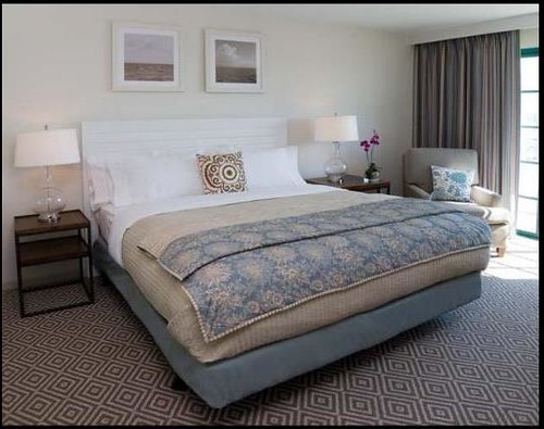
This (besides the little purple orchid) is a great example of symmetrical balance. It's perfectly balanced between the matching end tables, lamps, and single pillow to add a nice focal point.

Great example of asymmetrical balance (and a great arrangement for a wall with a slanted ceiling line!) The large sculptures on the dresser on the left seem to balance that side well and are balanced well with the white lamp coming down into the space. The white lamp actually seems more visually heavy in the space because of the high contrast between the light lamp and the dark wall paint.
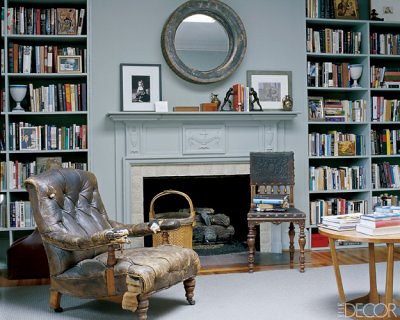
This is another great example of asymmetrically placed accessories on the mantle. Imagine the mantle with just the circular mirror and the two picture frames. It's not balanced with just that! By adding the dark book holders and small accessories in front of the gray framed picture it's visually balancing the darker frame and print.
Hope you enjoyed the lesson! (Click on the photo to be taken directly to the source. There are more examples of asymmetric vs. symmetrical design. It's a lot easier to see symmetrical, but sometimes the asymmetrical designs can be less obvious.)


1 comment:
So true. I am a little compulsive when it comes to balance..ha ha. Great examples!
Post a Comment